
We have all spent increased time in our homes since March. In that time spent at home, some have been making updates and improvements. In the spirit of home improvement, we’ve been following design trends. Sherwin-Williams is expected to announce their Color of the Year for 2021 this month.
Whether you are looking to update a room or give your home a facelift to bring it to market, a fresh coat of paint can do wonders to your home. Ahead of the official announcement, Sherwin-Williams has selected 4 color palettes for its ColorMix Forecast. Sherwin-Williams selected these palettes as an expansion upon their 2020 selections with 2021 being a continuation of “what the future holds” as we adapt to the New Normal.
What are the colors you can likely expect to see in 2021?

Palette: Sanctuary
Sanctuary is about Nature’s ability to cultivate wellness and calm, now more than ever. We have all been trying to spend time outdoors, and the sanctuary palette brings that indoors. This palette is defined by warm neutrals and natural tones.
Colors include moss greens, clay, grey, and beige
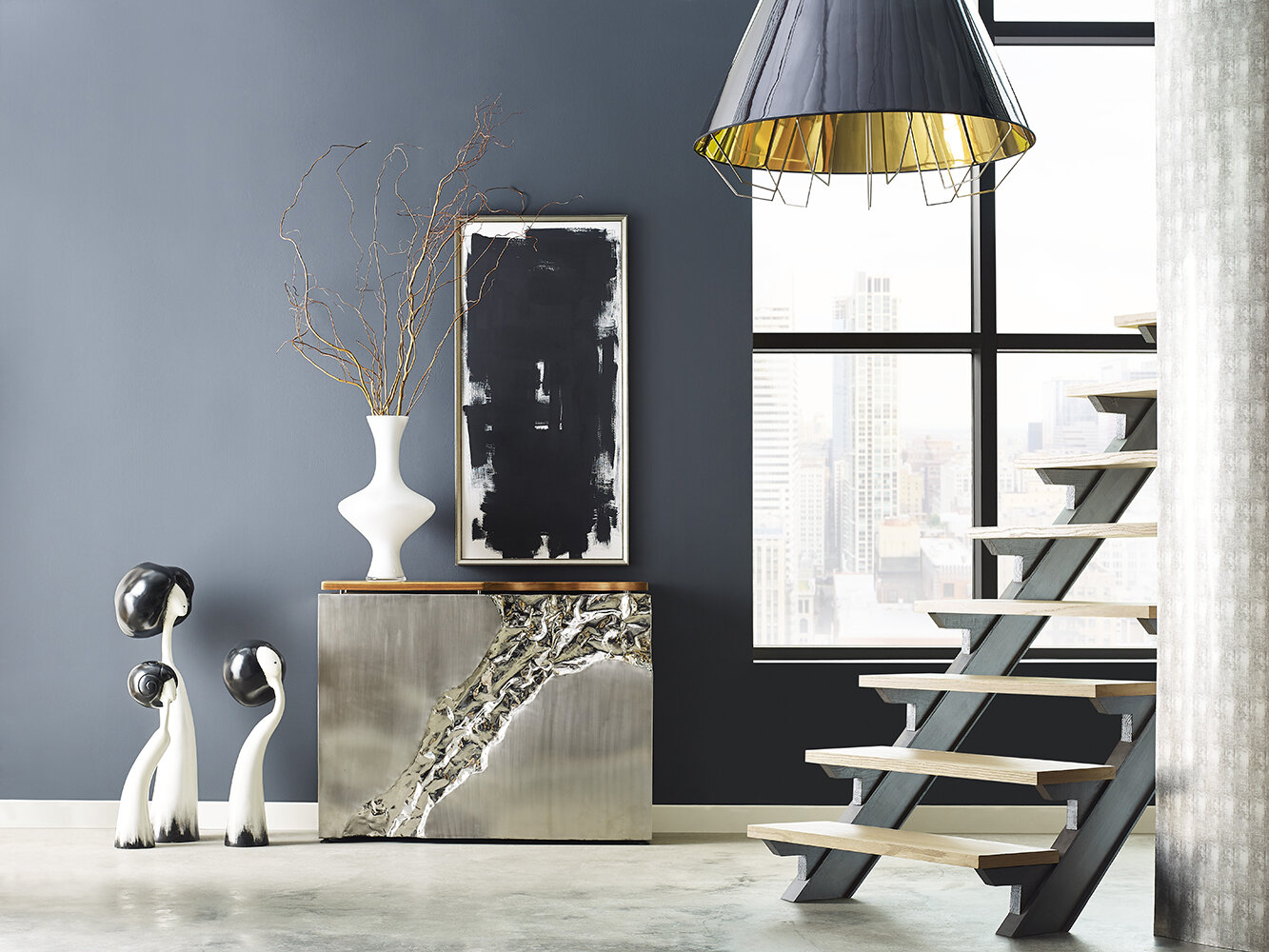
Palette: Continuum
The inspiration for the Continuum palette was drawn from how technology and smart living blends into our daily lives since the pandemic started. With many working from home, the impact of technology is more important than ever.
Hues in Continuum include Cyberspace, Crushed Ice, Lemon Fresco, and Novel Lilac

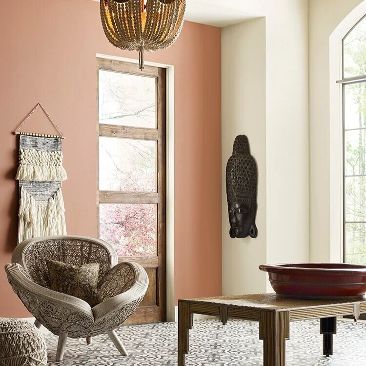
Palette: Encounter
The Encounter palette is about the storied heirlooms many of us have throughout our homes. It is a modern boho aesthetic characterized by rich earthy tones.
Hues in the Encounter palette include Java, Reddened Earth, Tarnished Trumpet, and Naval Blue.

Palette: Tapestry
Tapestry is a palette for those looking to brighten their home beyond neutrals. Tapestry is about creative expression and joy. This palette is filled with vibrant and bold hues such as Jaipur Pink, Cape Verde, Enjoyable Yellow, and Perfect Periwinkle
Images via Sherwin-Williams